Leaflet Evaluation
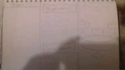
Starting this leaflet out, I made 3 different sketches before going straight into it. I wanted the leaflet to really fit the restaurant theme seeing as the theme of the leaflet was food based. The designs are kind of hard to see but out of all of them, my personal preference was this design.
Design 1

The reason being was that I felt this design fit the restaurant theme the most out of the other two. Not to mention I think this design is the neatest of the bunch. However, I would have liked to possibly include the restaurant environment from the third design below as I think it is more fitting and I reckon people would be able to understand the theme of the leaflet.
Design 2

I didn’t really like this design very much. This was an attempt at trying to make my leaflet fit a similar style to my map as I felt previously that I was lacking consistency. Either way, this layout and style is a little too messy for me anyway, though I do like the idea of the little slogan.
Design 3

If the one I chose didn’t work out then id have this one be my first choice. The restaurant design on the front cover is something I really do like but for some reason, I didn’t implement in the final product. The layout of the list of shops is also a thing I like as it is looking dancy and organised with its style. I still chose the first design seeing as it fit the style I was looking for more.
Refined Design

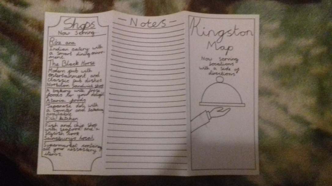
Once I did the sketches, I then outlined the first design with a black fine liner. This was to get a better definition of my leaflet look. This also made it easier for me to edit in adobe illustrator. I also decided to fold it on a separate piece of paper to test and see if it actually fits. The outline so far looks okay in my opinion, though I felt like the front cover was lacking a little in terms of design and so id probably change that later on down the line.
Leaflet on illustrator
(Contains missing fonts)

Here is the leaflet designed on illustrator. In all honesty, I feel like it could have been better as I feel like it’s not done to a professional standard. I also don’t know how to feel with the notes being more bluer than I would have imagined. I do like the blue gradient for the background, however. I think it looks nice. I also like the little banners at the top and bottom of the front page. The reasoning for making this leaflet look blue is because my map was also blue and so I kind of wanted to match them so they fit a similar theme.
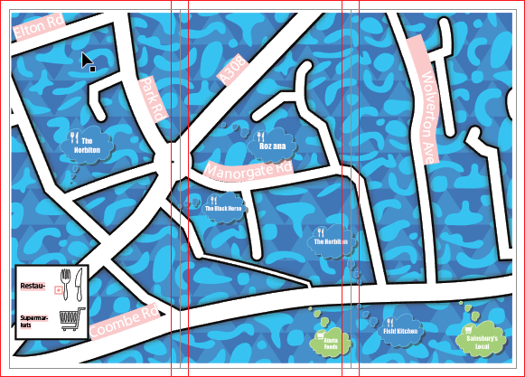
Map at the back

Printed leaflet

And finally here is the leaflet printed. With the fonts working and the leaflet being printed, it didn’t look as bad as I thought. Overall I am satisfied with the results. Everything fits on and the design looks better printed out than on illustrator. Though next time I’ll have to keep in mind the printing as the map at the back has been partly cut off due to a printing error.


