
Upon completing the comic at long last, I began to think back on what I could have done to improve on everything that I had done over the past 2 months of the final major project.
Research
Primary research
If we were to get an idea on a comic, research was needed to get a good idea. I felt like my primary research was sufficient enough as I looked at comics, magazine layouts, and books to get a good idea of how the layout should be like. Alongside this I also got a load of pictures of statues from the V&A museum, as the inspired artist we were basing this comic on did the same. This was helpful in getting the right poses needed as they should play a part in our comic.
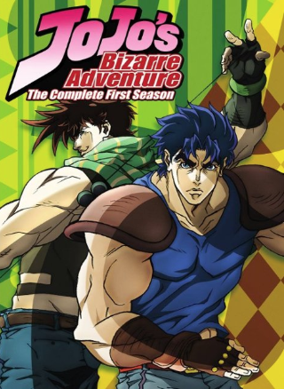
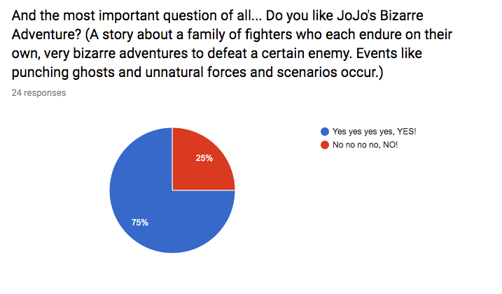
This part of our research was crucial. Seeing as our comic was based on the manga, Jojo’s Bizzare Adventure, I poured a good amount of research into the series and artist. The artist, Araki Hirohiko, would have books of models and statues to reference the posing of his characters. This was a key idea to include in the comic as it makes the characters stand out more. Alongside this, I also looked at how another manga portrayed story and layout as the two series’ were quite different. This part of the research was strong as they relate to our topic and they gave us good references.
One more useful piece of research was the animated version of the manga. This was particularly helpful for me because I was doing my part of the comic digitally on photoshop. A key thing I noticed in the animated version was that the linework on the characters was inconsistent which I thought was a nice touch as it makes it look bolder. As a result, I implemented this concept into the final product.
Independent research
Upon starting the comic, I did work independently without the assist from anything else for a good while until it came to drawing and adding effects. This was mainly due to the fact that I was comfortable with independent work until I actually needed it. Taking pictures of the sculptures were very useful, but even after that, I used a programme named Source Filmmaker, to pose some already made characters, which was a great way to study the human body. I later used these poses I had made using these already existing characters and used them as a reference for drawing the characters for the comic. However, I did not trace over them 100% nor did I copy their designs.
Finding my own research was not very difficult as I already had places to look for, one of them being a DeviantArt artist, username, Makani who helped make the official Team Fortress 2 webcomics. This artist, in particular, was one I needed to look into more as their style is quite exaggerated and it really stands out, most noticeably with the facial features. This was a similar style I was hoping to achieve. Despite this, I feel like I could have done more research on the human figure as in some areas of the comic, some of the limbs on the characters are a little disproportionate.
Influences
I was influenced by both Araki and Makani’s work. Within each season of his comic, Araki would change the style of the characters which I thought was helpful for my partner and I as our styles weren’t identical. Mine and Araki’s style of working were quite different however as he works with pencil and ink whereas I work with a digital tablet. I draw digitally because I find it makes drawing art much easier for me, especially because my pacing is slow. Makani was very influential as I attempted to replicate the exaggerated style that they had used. I had also looked into their use of composition and layout which I found useful because of how clean the layout was. They wouldn’t just scatter the panels like some manga artists do, they would neatly compact them in the page layout most of the time, which is what I aimed to do in the comic. That and they are also a digital artist.
Planning and time management
As tight as the time was for me, we did manage to submit the comic on time, with minutes to spare. I should have had it done a lot sooner but I never really had a schedule on when to work on the comic. I had only planned on working on it whenever I could and even then it took a good amount of time. At some points, I would easily get distracted which, surprisingly enough, took away a lot of time.
Time management
In terms of time management, I was VERY slow when it came to creating the pages for the comic and I assume this is because of both my lack of confidence when working outside of home, and due to the fact that I am a perfectionist, I would spend too much time on the smallest details, some of which being unnecessary. I probably could have sped up the process if I had planned the main character beforehand because I was drawing her without a clear design in mind.
Schedule
My schedule was not as clear as I hoped it would be. It mainly consisted of getting the sketches done at home and doing the linework outside of home. Despite this, I still managed to follow it well, however, I should work on the speed of my drawing as that really slowed me down, focusing too much on small details.
Developing and Modifying Work
In all honesty, we didn’t go through an enormous amount of changes throughout creating the comic, but I felt like the ones that we did decide on where necessary.
Changes
One of the changes I thought was important would be the style change. For a good while, we struggled to decide on a definitive style. After some practice, I came to a conclusion. For my section, I did a combination of the manga’s style and my own style. I ended up lowering the detail on the original style as I thought would be too much work and it would slow me down to a point where I probably wouldn’t have finished. Here is a comparison.


Upon changing the style, I also decided to add different forms of detail in the form of little lines which reference the manga doing the same. It was a simple and effective way of adding detail, which made the character look less plain.
Another change we went through was the introduction to a character named Leon Rogers who was going to be a friend of our main character, Jozeya. Later however we decided to remove him as he played no significant role in our comic, apart from moral support. I feel like this was a necessary change otherwise we would have had too many characters for such a small comic, let alone having a miscellaneous one.
Once more, the script was also vastly changed to better take up more of the pages. The script we had beforehand included some very robotic and almost dull dialogue as there wasn’t any interesting speech included. That and there wasn’t much dialogue to begin with. This reboot to our script was just what we needed as it now included dialogue that was much longer and more interesting. So much longer to a point where I started running out of space for some of the text on the pages. We even included a reference to the original manga.
I’d say our ideas were varied enough to include them in a list. But at the same time, there could have been room for more ideas. But for such a small comic I don’t think a huge amount of ideas are necessary to make this thing spectacular.
Experimentation
Adding shading to the comic was an idea I had throughout the production of it. As a result, I didn’t get to experiment with how lighting works so I had to assume and make it up on the go. Though at some point I did experiment with using a black layer on photoshop with a lower opacity and that seemed to work instead of using different tones of grey. Though I think using the different tones of grey would have been quicker. I also tried to experiment with thicker shadows in some areas which were more suspenseful to emphasise on the tone of that section, and I think it turned out pretty well. However most of the time, I didn’t pay attention to light very well as the shadows are drawn in a way which makes it look like the light source is coming from in front of the character.
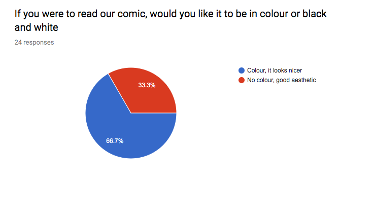
The front cover was different because I had to actually work in colour, unlike the other pages. Because of this, I had to try out different colour schemes and see which one was a good fit. The theme of the original JoJo manga is purple, so I thought it would be a good idea to bring back that colour scheme. I got the theme of the colour for the main character with a little help from Adobe Colour Wheel. If the Jojo manga was good at one thing, it was making bizarre things look natural. So I experimented with different colour schemes for the main character.

For a long time I had envisioned the character to be blonde, but officially putting the colour into action made me realise it doesn’t actually suit the character in terms of appearance. I also didn’t like the combination of yellow and brown as I thought it looked too ugly. Experimenting with colours doesn’t just mean making a good colour combination.
Colour
Taking this into consideration I also thought about colours and their representations, which is why I felt like purple was a good theme as it represents nobility, power, dignity, devotion. All the things a protagonist needs. The added grey was to make the colour look purer as it was a lighter shade of grey.
Effects
Effects were a thing I was thinking about too. Having read a few books and comics myself, improvisation was the way I went about with these effects and I attempted them from the top of my head. I would have liked to try out these effects before instead of during production but I was worried id have no time. These included effects like lines and bold text to put more emphasis on the situation.
Ideas
With all of these ideas, I think I spent a good amount of time thinking about them. It’s just a matter of if they were a good idea that I needed to consider, like the script which had to be changed during production. In total, around a month was spent thinking and developing ideas, but there was just as much time spent on the ideas during production too. I still would have liked to think about them more so I could better polish up the final outcome, and I feel like some areas are a little unfinished, for example, concept art, which I didn’t do enough of.
Materials, techniques and processes
Materials
Although I had tested the style once in pencil before starting the comic, all of my half of the comic was done digitally with photoshop, which meant that the use of materials wasn’t varied and instead I stuck with only one, the Wacom Tablet. With photoshop, I used around two different brushes but it was almost done with a general brush. The other brush was for the splatter effect on the third page. Being experienced with photoshop, this proved less difficult for me to use and had a good impact on the outcome of the comic as the brush tool can help me produce high-quality linework.
Techniques
When it came to creating the layout of the pages, a tool that really helped me with that was the Ruler tool. Because I didn’t know what specific measurements to take, the ruler tool helped me to get the accurate measurements which made it less difficult. I feel like this affected the final outcome by quite a bit like the thing that holds the comic together is not only the linework but the layout too because of its compact and tidy look, making it comfortable for the readers.
Processes
Creating each page was a simple process of creating the layout, sketching, and going over with the brush tool. The only hard part about it was making it look good for the readers. I did use a bit of help from Source Filmmaker to help me pose the characters before actually drawing them. Despite the length, it would have been more difficult if I didn’t go along with my current process and I feel like this was crucial to getting the right outcome for the comic. Because of this process, the comic looks a lot better than it would have.
The Final Outcome
In the end, the comic was presented as a pdf file featuring all of the pages. I figured this would be an easier way of presenting the comic as it would be higher quality and it only requires a few clicks to view. Although this is the case, we are hoping to have it printed as an A5 book for it to be presented better. The idea of making a comic was there since the start of the Final Major Project and I thought it would be a good way to test and improve my art skills. At the time I was really inspired too, because of the statues at the V&A museum. Not only that but because of the people drawing there too.
Brief Response
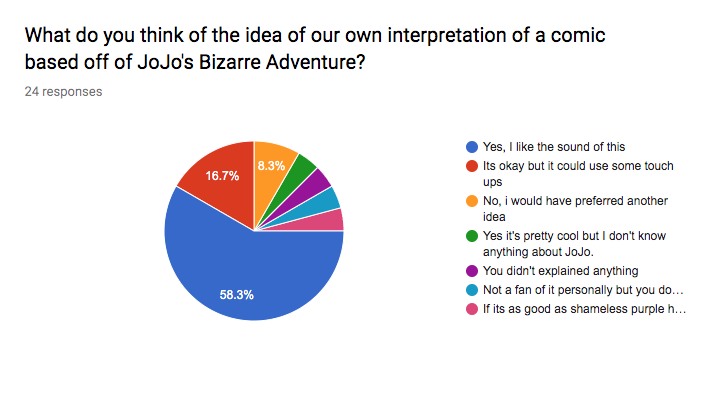
I feel like it responded to the brief decently well. I am really pleased with the final outcome of the comic, I do feel it is in high quality and it has the right amount of page numbers. However, the sole purpose of going to the museum was to get inspiration for an idea on the final major project, which was a key part in our brief. What inspired me were the sculptures and the Chinese cultured items, as we originally planned for our comic to fully take place in Hong Kong. The sculptures were what inspired us to go with the idea of a comic based on JoJo as the original artist used sculptures as heavy reference.
Despite this, I could have looked at more in the museums because I feel like I didn’t look at enough to get a better idea of what to do sooner. I did return to the museums due to me only visiting one the first time, but my thought does not change.
Final thoughts
At the start, I was worried about the quality of the comic, but in the end, I think the quality was a lot better than expected. The linework was something I put a big focus on as it would be the definitive feature to catch the readers eye. Also, even though I didn’t have a good idea of how lighting worked, I still think I managed to make the shading look nice. With these two combined, I think it really ups the quality of the comic, along with the added effects which make the comic stand out more.
Strengths and Weaknesses
Strengths
One of the biggest strength would have to be the linework on the characters and its style of inconsistency which makes it look interesting and not as messy as you think. I feel this style choice was quite beneficial because of that reason and it would have been better than one singular brush size which, although acceptable, looks more boring in my opinion.
Layout played a big part too. I had hoped to achieve a neat layout that conveyed emotion depending on the shape and size of it and I feel like I have achieved that in some aspects. It is neatly presented too and I feel represents Mankai’s layout style pretty well too.
Another strength I feel is the shading for the comic. Despite the lack of knowledge of how lighting works, I still think I made it look decently nice, emphasising on the thickness of the shadows depending on the emotion. If it weren’t for the lighting and different shades of grey, the comic would have looked more boring.
Weaknesses
I would have liked to produce more concept art beforehand as that probably would have sped up the production of the comic by a bit in terms of knowing what everything looks like. I feel like setting up for the comic was something I lacked and that greatly slowed me down.
Another thing I would have liked to improve would be the time management as I feel like I wasn’t the best with it, specifically, keeping a handy schedule. This would have greatly improved the production of the comic and it would help keep things more organised.
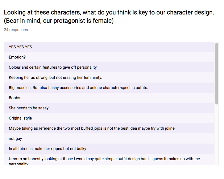
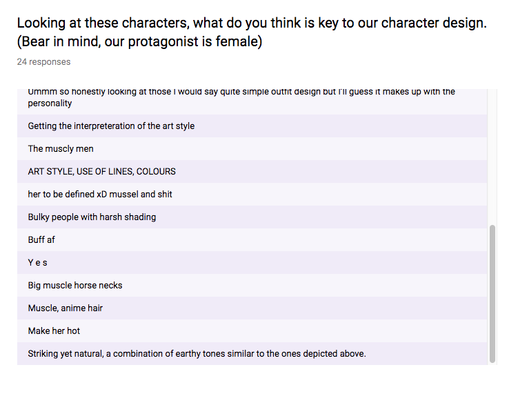
Lastly, some of the facial expressions in the comic are a little flaw of mine. I feel like some of them are a little lacklustre and could have been further emphasised on to give off a more accurate emotion as some of them seem emotionless, which doesn’t represent the inspired artist very well.
Improvements
Throughout the entirety of the FMP, I feel like my work has become better in terms of my abilities and techniques within photoshop and this has really helped me become more confident in my artistic abilities. I just would like to improve on the speed of how I draw as that is one of the biggest flaws I have at the moment.
Conclusions
If I were to do this project again, I would put more focus on planning for the whole comic. In the project, I feel like we put more focus on some things more than others which isn’t really the best method. Alongside, this, producing more concept art would be another thing I would do as in this project I didn’t do enough of it and as a result, it slowed me down by quite a bit. Lastly, I would improve my time management by actually creating a working schedule to follow which would speed up the production.
What I learnt
Upon completing the comic, I learnt that the process of actually creating it is a lot harder than it seems. However, this has also taught me that I need to be more organised when it comes to time management. A lot of effort can be put into the final product, but this also taught me that the pre-production stage is just as important as actually creating the comic as it helps set the foundations of the final product with a plan.
Overall the final result of the comic came out way better than expected. At the start I pictured it being very simple, but during production, the quality upped itself by quite a large amount. There were quite a few errors once we had finished but I managed to get them fixed in time. I really enjoyed the process of making this, as stressful as it was, and it has taught me a lot in terms of the creation. I feel this will benefit me in the future as it really tested me to go further with my drawings.
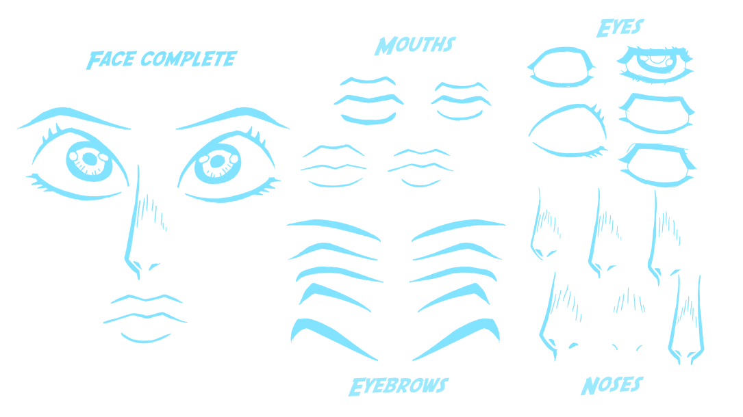
 So now was the time to try testing a similar style on an actual person with a full head structure. To test it I did a sketch of one of my friends in the style of the JoJo manga. The difference with this and the previous art style test is the very bushy eyebrows which were a noticeable feature in the third part of the series, along with the hexagonal eyes. I also added lines that act as shading to get that extra comic style. I also attempted to try and add little dashed next to the nose to add slight originality as this was a combination of my art style mixed with the manga.
 Next, here we have a sketch of one of our characters in the comic named Ling. Fun fact, the look of this character was based on a drawing my partner did as a joke, seen on the right. I took the key features and implemented them into my own style, most noticeable the hair. This time I attempted to change up the style by adding more lines that better follow the original style but not to a point where it’s a complete copy. And now each facial feature is redone in my own style. The eyes, the eyebrows, the nose etc. I think this looks better.