
We were tasked to create an app that showcased our interactive map. We used a programme called Adobe XD for this as this programme is specialised for doing so.
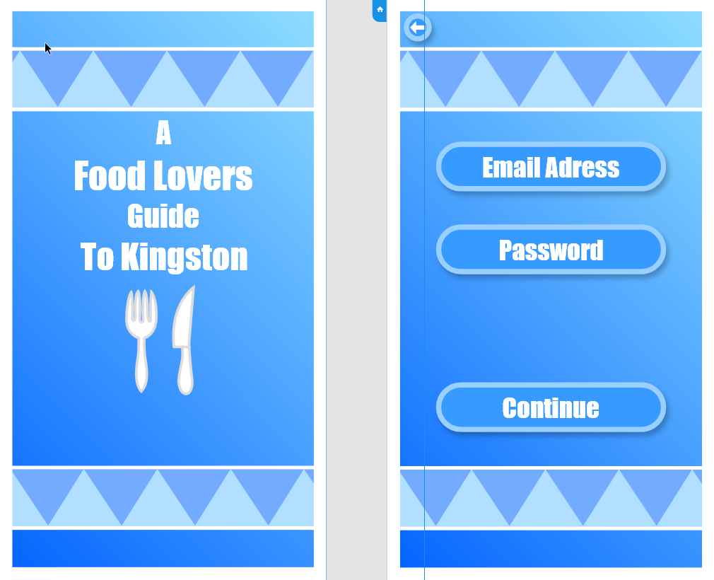
To start off, I made a base background that would go on all the slides. Seeing as this was based on the map and leaflet I decided to base the look off of the two which had a blue theme. Adobe XD wasn’t too difficult to use. I thought about doing a simple design because the app itself is also simple. I do like the look as it is very clean, and I really like the blue gradient in combination with the triangle stripes. They compliment each other well.

Next up, the selection buttons. The apple guidelines mentioned they like a clean look, so I attempted to achieve that look. I think I did a good job at trying for that look and I think it is also a satisfying look that goes well with the whole theme and background, despite how simple it may look. I also added a little arrow which, when clicked on, takes you back to the previous page.
I decided to keep the style consistent as I was worried if I changed it too much it wouldn’t look as good. A little thing I would have liked to add would be the logos of the food places on top of the button instead of after you click on it. I decided to include the map in the app as I thought it would be convenient for people who need a visual direction.
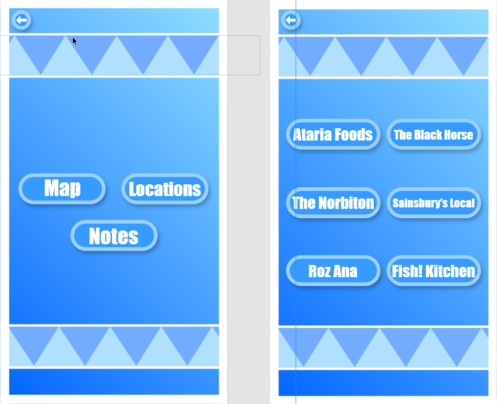
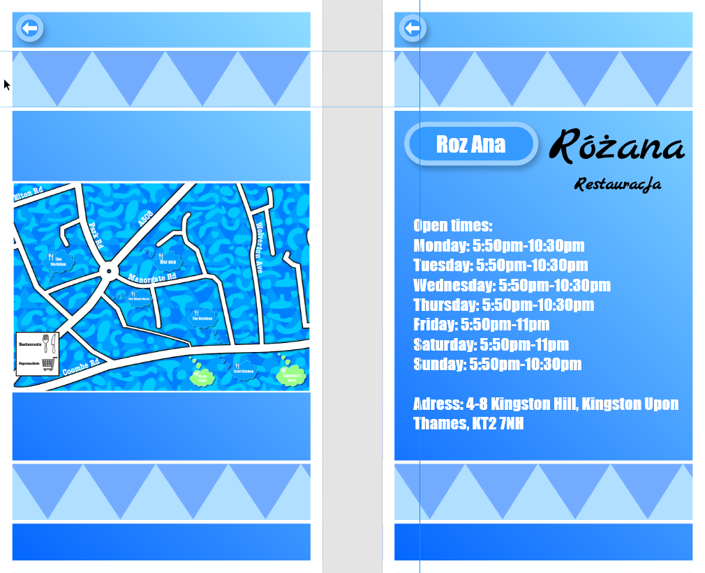
Here’s what comes up when you click each of the buttons. I feel like the map could have been placed better seeing as it looks a little small which will make it hard to see or read any of the locations on there and it doesn’t look very neatly placed, not to mention it also kind of looks out of place.
As for the info page. I wanted to make it a page instead of an infobox as I felt like it would just be out of place. I’m happy with the layout and look of the info page as a result. I think the added logo of the food shop on the side is also a nice touch. Not only does it add more to the page but it also provides information on what the logo looks like if they ever look up the food place.
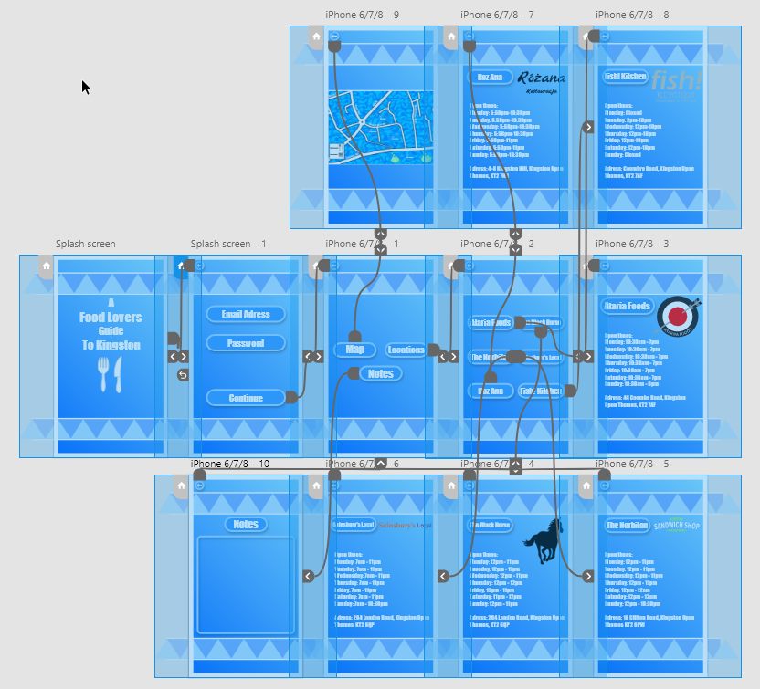
As for the notes, the decision to include them was very last minute but I figured it would be useful to include as people may need to jot down some important info. as for the design of it, it’s simple but effective which I think is good. I thought about filling that box in blue but I thought it didn’t look good so I decided to leave it hollow instead which looks better in my opinion.

Once the designing was done, it was time to make it interactive. This process wasn’t very difficult really as all I had to do was drag the arrows to the corresponding places I needed the transitions to go to. Speaking of transitions, I chose a slide transition because of how natural it feels, like reading a book and how you turn the pages. If I left it as a dissolve it would look nice but not as interesting.
Overall I am really happy with the way the app turned out. I think the colours and layout are very neat and clean. I also think it is very satisfying to look at because of the lack of black outlines, unlike the old version of my map. It also functions very well and the use of sliding transitions makes it better.
