Unit 4, Unit 34 and Unit 72 - Game Treatment and Expo Poster

Animation feedback

Our animation had been completed, and the feedback for my one had been positive. Although that is the case, there were some errors i had with the animation and the same with a few other people.

Screen Shot 2018-05-24 at 15.54.37.png

As you can see, I received a 10 the most. The people who gave it a lower number must have seen the errors I had with it. This shows me that my animation appealed to most of the people who watched it.

Screen Shot 2018-05-24 at 15.57.30.png

Quite a few people liked the animation for its art style and animation style. What stood out about the art style was the eyes and how “cute” the characters looked. And for the animation style, they like the fact that it was mainly moving images.

Screen Shot 2018-05-24 at 15.57.42.png

These opinions were mixed. On one hand, people said that the soundtrack needed improving, but on the other, people also said things on relating to the art style, mainly the characters, and i agree with them.

Screen Shot 2018-05-24 at 15.58.01.png

The majority liked the smoothness in the animation with the movements. I decided to use motion pictures instead of frame by frame because it was easier and I was more experienced with motion. This can be an animation style I can use in future.

Screen Shot 2018-05-24 at 15.58.33.png

Overall people didn’t mind the sounds. They thought it fitted with the animation. Personally, I thought some of them would have been a little loud like the pop and the click.

Screen Shot 2018-05-24 at 15.58.17.png

The people also thought the pacing was okay with the animation. I could have been improved upon the timing but i felt like it was a little slow.

Screen Shot 2018-05-24 at 15.58.39.png

I was supposed to add a third option asking if it was just right, but I forgot. So the majority of the people said that it was too short. This could mean that they want to see more of it and next time I will take into consideration the length

Screen Shot 2018-05-24 at 15.58.48.png

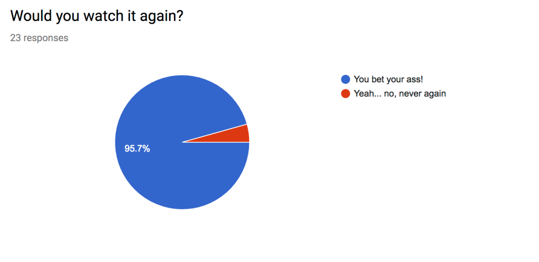
Thankfully, almost everyone would have liked to watch it again. The one person who said no must have seen the imperfections I saw, which I respect. This shows that the people actually liked my animation and must mean that i achieved some good outcomes.

Unit 4, Unit 34 and Unit 72 - Game Treatment and Expo Poster

Photoshop lesson: Controls

In today’s lesson, we needed to create the controls for our car racing game. Seeing as my game would be on at least 3 different platforms, I would have to do 3 different control layouts. So here they are.

Controls xbox.png

The first one is the Xbox One. I decided to do the Xbox one, mainly because the Xbox one is my preferred console over the PlayStation 4. The words explain what the corresponding button does. The lines show what button does what.

Controls ps4.png

Next, the PlayStation 4. These 2 consoles were chosen because they are the most popular, and it would only be fitting if the game was playable on those consoles, as it could attract more players. Same rules as previously applied.

Controls PC.png

Lastly, the PC. Not exactly a console, but you can game on it. I chose PC because I feel it is more popular than a console.

Unit 4, Unit 34 and Unit 72 - Game Treatment and Expo Poster

Kieran’s lesson: Finishing up

In today’s lesson, we needed to go over a few things that were missing in our sketchbook and try and fill them in. The things I thought I needed to include were things like more environment drawings, item pickups, materials, etc.


20171123_092334.jpg

During the lesson, we were also told to go outside, grab a few pictures and turn one of them into a drawing. One of my drawings had featured the Bentals shopping center in Kingston. I chose this picture because it felt fairly simple to draw and I liked the shape of the building.

Here is the drawing of the picture that I did. As you can see, it’s not 100 percent accurate. Don’t mind that. I like this drawing mainly for its slight accuracy and for how neat it is in some areas. I felt like I could have done something more with it, however, Maybe by shading it in or adding colour. Problem is I don’t have a huge variety of colours.

Unit 4, Unit 34 and Unit 72 - Game Treatment and Expo Poster

Simons lesson: Drawing the model 4

In today’s lesson, we drew the same model one last time with a new method. This time we used colored chalk to draw the model. I started by drawing the rough outline of the model and then I colored in the model. Overall I found this task to be semi-easy, the hard part was getting the shading right. This method also taught me how to use colored chalk better and how to create smooth colors.

24992501_1283844518428628_1113723211_n.jpg

Here is the first drawing I did. Obviously not finished, unfortunately. This method wasn’t as difficult as the remover method because I didn’t have to start out with a canvas, completely coloured black, and then remove the bits that were light. Instead, I could just draw an outline and shade it. We did this first drawing with chalk.

25189641_1283844395095307_1920361959_o.jpg

Next, we used the same method, but this time the model was posed differently and I didn’t have to use so many dark tones, but I still had to include shading. This again wasn’t as difficult because I was using a technique I am used to. This was done with a graphite pencil.

25129948_1283844358428644_1580064547_o.jpg

Finally, we used coloured chalk to create the last piece using colours given to us at random. Funnily enough one of the colours I was given was skin so, you can guess what colour i used to colour the skin. I thought that colour with blue hair would make a nice contrast.

Unit 4, Unit 34 and Unit 72 - Game Treatment and Expo Poster

Illustrator lesson: The final poster designs/comparison

In today’s lesson, we began production on the poster design for our game. As you might know, the theme of the game was London and it was a racing game, so of course, I would try and fit the colour scheme and overall design with London.

Drifty Poster ting ting ting.png

This first one I did took a while but is gladly done. I personally like the layout of everything on the poster and how it kind of fits in the frame. The frame is pretty thick for printing purposes. I also like the look of the logo as i feel it fits with the racing theme, as do the colours of the letters. The colours represent the colours of the British flag. The colours were originally blue white and red but because the colours in that order represented the french flag, so i changed it to white blue and red so it would represent Britain more. However, I feel that the colours on Westminister are a little too dark for the game and I feel like there is not enough on the poster. The border is also a different shade of red and personally, i don’t like that, id rather have it the same red as all the other reds. I decided to go with this font because i thought it would be a good fit for the game, seeing as it’s targeted for a younger audience. I didn’t want a font that looked two roman or anything, although this could represent London well, i don’t think it would look good for a game like this. This font looks bold, flashy and fast, which is why i chose it.

Drifty ting ting 2.png

This is my second poster, and personally, I prefer this one over the previous one. This one is more colourful and includes a lot more on the poster. Not only that but its also easier to tell this is a car racing game because of the car. To further represent that this game is based in britain, i have the british flag in the background. This one surprisingly only took half an hour. A flaw I could mention with this one is that it may be a little too messy and maybe there could be more shading on the car, but other than that I am happy with the end result.